Nothing here is financial advice. Everything here is crazy number logic.
Three weeks after the bitcoin ETF products started in the U.S. on January 11, 2024, perhaps we can take a step back, take a look, and gather some perspective.
We've already gotten a slick website to monitor data at
Figure 1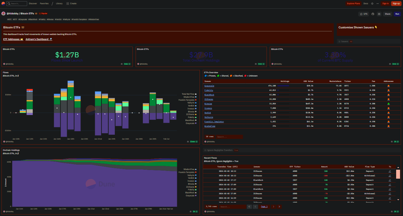
Seesaw
Listening to podcasts and reading through various bitcoin sources, it seems that there's a seesaw battle going. On one side, the "inflow" side, money is flowing into the bitcoin ETFs. This buy pressure should drive the price upward. On the other side, the "outflow" side has GBTC being sold and cash is flowing into shareholders' brokerage accounts.
If inflows outweigh outflows, the buy pressure outweighs the sell pressure and the BTC price seesaw tips toward "number go up."
If the outflows outweigh the inflows, well, number go down.
The graph below shows the inflows and outflows since the ETFs' start. Consider the 0-level baseline as something of a water level. Above the baseline water level are inflows of money, BTC buys, (each ETF with its own color moving up vertically). Below the water level are GBTC's outflows of money, BTC sells, shown in purple moving down vertically. The white dot for each vertical column is is the net difference between inflows and outflows. For the number to go up, we want to be above that baseline to a net positive - we want our head above the waterline. Thus far, as you can see from the dots, the trend has been a bit all over the place, up and down, bobbing above and below the water level.
Figure 2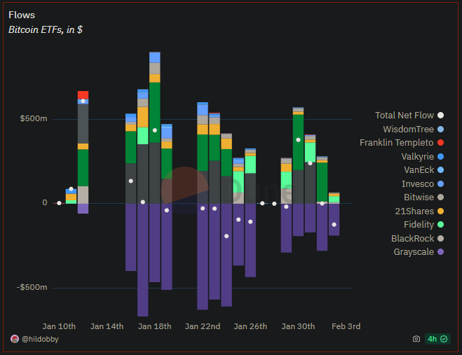
Of course, there are many other factors and people and institutions impacting the bitcoin price - it's not just ETFs alone - but within the ETF bucket, this seesaw concept is mentally manageable and seems plausible economically.
Purple decline
Grayscale's GBTC is represented as purple and its sell off is the hindrance. Sorry, Nostr, but in this case, we don't like purple. 💜 GBTC has been around longer than the other ETFs (I'm not sure how exactly they finagled that) and is the big player in this game. Two things to note in the chart below:
1. GBTC is currently huge at $20.5B (the next ETF has only $2.7B)
2. GBTC fees are also huge at 1.5% (most have around 0.25%)
Figure 3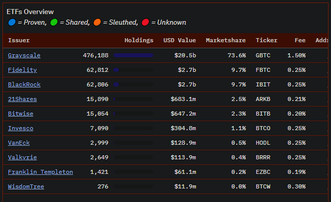
Unsurprisingly, people are reacting to incentives and selling GBTC to get out of those high fees. Ideally, they would reinvest back into one of the other ETFs with the lower fees.
A few things are at play here with anyone who currently holds GBTC:
- GBTC holders may sell GBTC and then buy one of the lower fee ETFs to retain the hedge of having a stake in BTC price action. By selling GBTC and buying ETF, the outflow/sell would be counterbalanced by an inflow/buy. For bitcoiners, this would be the preferred scenario as sell pressure and buy pressure would balance the seesaw to a zero net effect.
- GBTC holders may sell and then find themselves suddenly flushed with cash. Naturally, money will go to various places. They may decide on a cruise, or a stock or fund they've been eyeing, or paying off a debt, or a wedding, or a new truck. Life happens. In this way, it's not realistic to expect all of the GBTC funds to be reinvested into a low-fee bitcoin ETF. They won't be. This is the sell pressure that will hold the BTC price down.
- Some GBTC holders will take no action. They know (maybe) they have GBTC in a fund, somewhere, and they don't micro-manage those things...that's what advisors are for. Or, they're busy with life at the moment, or they want to see how things pan out, or they're simply happy with their portfolio as it is, or whatever. Some people will not move their funds. That GBTC will just sit.
Consider the proportion of BTC held by funds currently, as shown in the graph below. There's a lot of purple.
Figure 4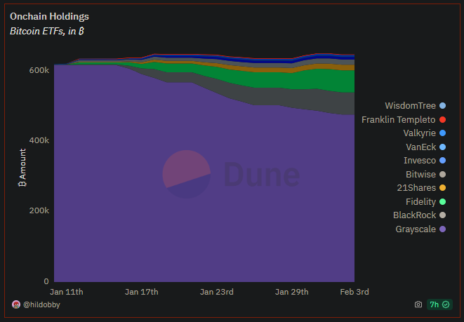
Above, I used the word "hindrance" referring to GBTC being sold off. Maybe that's the wrong word, maybe "healthy change" would be a better phrase. The movement away from GBTC is a natural step in the toward-ETF process. Simply put, we want to see that huge purple chunk continue to diminish, as it's doing. It's currently, obviously, the mammoth in the room, but it is declining. Eventually, it will reach a point where the sell pressure of GBTC has run its course...either it will get to the level where holders no longer wish to sell, or it will get to zero. Either way, the GBTC sell pressure will end.
I have to note here two things:
1. GBTC could theoretically also have buy pressure. Not sure why anyone would do that given the fees, but it could add buy pressure just as much as the ETFs have been doing.
2. Conversely, the ETFs could add sell pressure. Right now, people are buying in and hodling. At some point, they will sell. Those colored columns above the water level will, at some point, may point below the water level at times. That seems a rather far away at the moment though. Plus, my guess is that the net will stay positive. One person may sell their ETF funds because that's where they are in life, but the gross aggregate I think will hodl.
The shape
So, as we watch the purple decline, the question arises, "How far will the purple graph drop, or, where will GBTC's outflow/sell pressure end?"
A simple view would be to take the three categories I listed above and just use the rule of thirds to slice things up.
- One third of GBTCers sell and rebuys another ETF.
- One third of GTBCers sell and cashes out (does not buy back into a BTC ETF).
- One third of GBTCers simply hold onto their GBTC.
Using this simple, stupid simple, framework, 2/3 of the roughly 600k BTC that GBTC held in the graph would slide down and the purple decline would gradually level off at around 200k. With GBTC currently holding 476k (see table above), that's 276k still yet to be sold off. That's roughly $11.8 billion. That's a lot of sell pressure. But, it's not insurmountable for the buy pressure to counter, especially if it's spread out over time.
The third-third-third angle is one way to look at it, but here's another way that I dumbly call "The Shape."
Six years ago (Jan. 20, 2018) I wrote about "The Shape" at
A trend I noticed, and I'm sure others have seen this, was the shape of the price rise, peak, fall, and reestablishment of support. I drew that shape as below:
Figure 5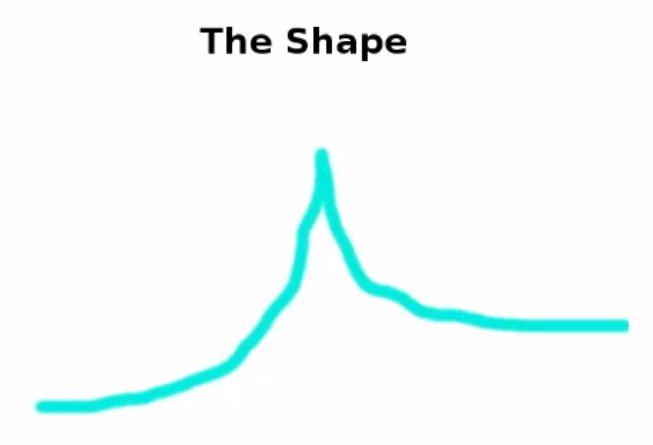
And I included an animated gif to illustrate the concept:
Figure 6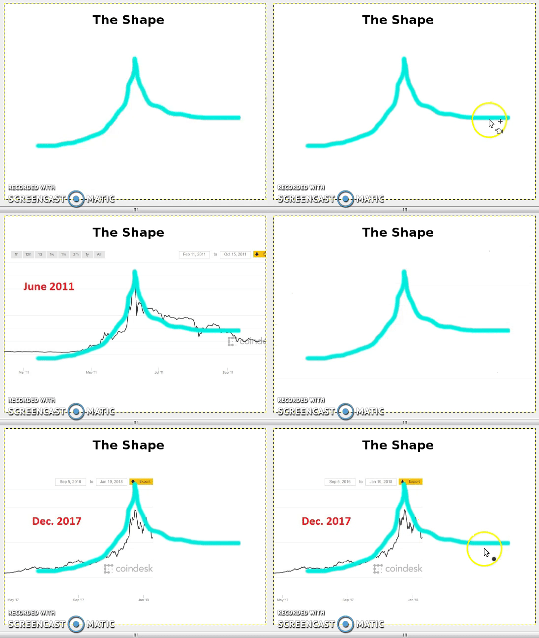
It's definitely not exact. But the theory is easy to grasp: there is gradual growth, then excitement, then a euphoric rise no doubt FOMO-fueled, then a fragile peak followed by a drastic drop, then finally a general leveling out as new support is established. The bubble has burst, and bitcoin has died again. However, the newly established support level, though considerably down from the high, is also considerably more than the baseline that had existed prior to the run-up. Let's mark those points below: red is the original support line, green is the peak, black is the new support line.
Figure 7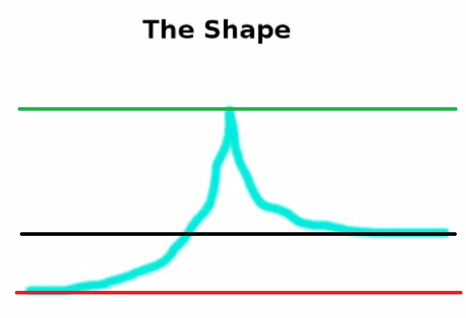
Considering the third-third-third theory above, it's somewhat ironic that the black line, the new support line, is roughly one third the quantity between the red and green. The point is that the price seems to have stabilized in a roughly consistent position after each crash.
I feel there's something, not sure what, but something to the consistency of those proportional markers. More particularly, I look to psychology for a possible answer.
Making changes requires new ways of thinking and viewing things. Adopting bitcoin and thinking about things through a bitcoin world view definitely requires a rewiring of one's brain. This is not easy and not immediate. It takes time and it takes lunges up the mountain and sometimes requires deep slides back down to reestablish solid footing.
I'm sure many of you have seen the graphic below:
Figure 8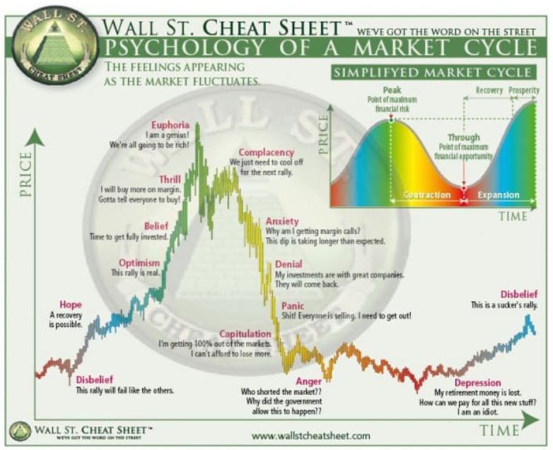
Source:
There are other versions of this, but each suggest the same pattern, the same general shape.
There are two takeaways here in my view:
1. There are human emotions driving, aligned with, or resulting from the wild fluctuations in the market cycle depicted.
2. When taken as an aggregate of humanity, this market cycle may be like the stages of grief (
The psychology of human differences tells us that two people may respond to markets in very different ways. One person may innately always remain calm and stick to decisions stoically throughout the cycle. Another person may ride the emotional roller coaster and make decisions as wildly as the market fluctuates. But, altogether, psychology tells us that the human brain works in patterns.
There is a reason that the wisdom of the crowd works to guess the weight of an ox (
Applying "The Shape" to the bitcoin ETF puzzle, the question, again, is, "How much will the purple GBTC graph decline?" Let's take a giant psychological leap and flip the shape vertically since we're looking for a decline rather than an increase. Flipping the shape gives us this:
Figure 9
Disregard the sharp drop then rise - that would represent FOMO sell, which I guess is a thing, but doesn't seem to apply here. What I'm interested in is the net drop from the top left baseline to the rightmost baseline.
Superimposing that inverted shape onto the GBTC holding graph, we get this:
Figure 10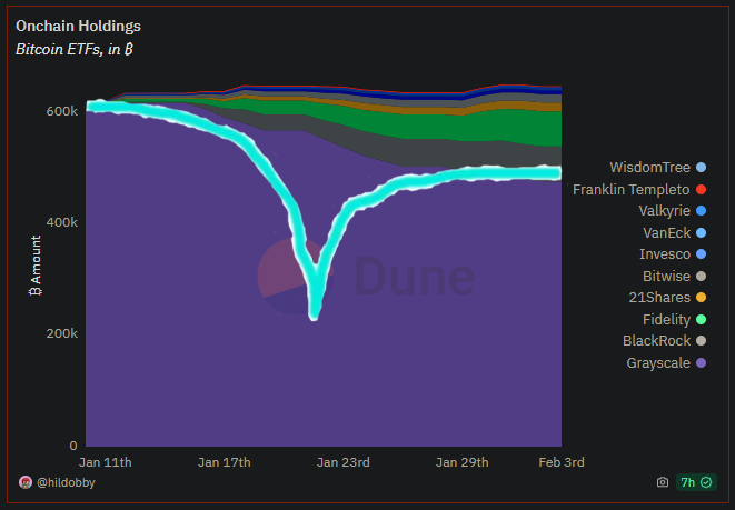
It's hard, or impossible, to predict how the purple GBTC holdings will diminish. The decline has been roughly linear so far. Perhaps it will continue linearly and this graph is hogwash. Or, looking back at Figure 4, there does seem to be a slight leveling of the purple in recent days - the negative slope of the GBTC "line" seems to be slowly nearing zero, slowly flattening out. I'm not sure if that's my imagination, wishful thinking, dead wrong, or if there's anything at all to it, but it does seem to show a kernel of a trend there.
If, if, IF, there's anything to this "shape" theory, Figure 10 would suggest that the GBTC sell off might be less than might expected. Rather than dropping to, say 200k BTC as with the third-third-third theory, the sell off might level off at a considerably higher level. If so, GBTC's purple dominance would still show obviously today. However, the other ETF funds/colors would begin to grow. Eventually, the ETFs would slowly diminish GBTC's proportional dominance.
Below is a brutal graphic of how things might pan out when we "zoom out" and look at a broader, future time frame:
Figure 11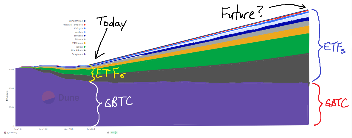
This is wildly guestimating and contains the assumptions that (1) GBTC will stabilize in size and (2) the ETFs will grow in size rather than diminish. With these assumptions, the point here lies not in any accuracy of the graph...this is merely a visual to help my chipmunk brain conceptualize things. The point lies in the proportions held by the ETFs versus GBTC today and then compared to the proportions in the future. Whereas GBTC holds a majority today, in the future they likely will not.
### Summary
As the GBTC sell-off "threat" diminishes, it stands to figure that the BTC buy pressure from the ETFs will gather steam. If you wish to go bare knuckle brutal in estimates, extrapolate the timeline I drew to get a date. The ETFs have been around for 24 days so far (Jan. 11 to Feb. 3). I got out the digital measuring stick, estimated the distance/time from ETF start until today at 3.6 cm and the end of my timeline as 19.4 cm.
Figure 12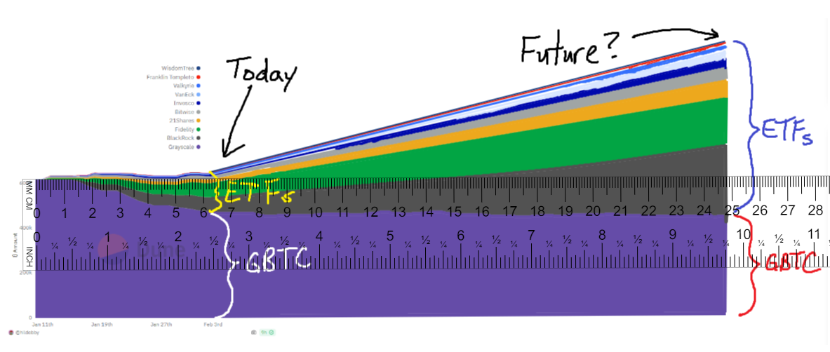
I scribbled out the proportional algebraic equation and solved it below to make my eighth grade math teacher happy:
Figure 13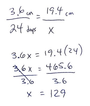
I got lazy and instead of manually counting out when 129 days is from January 11, I asked ChatGPT to do it for me. I got this:
Figure 14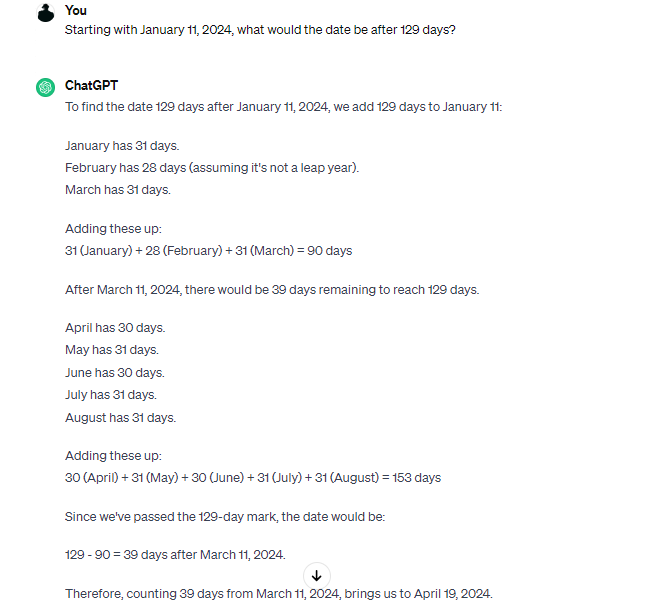
ChatGPT said the date would be April 19, 2024 (turned out wrong!). Since there actually is a leap day in there this year, that would make it April 20, 2024. How ironic, 4/20, almost the exact same day the next bitcoin halving is currently expected.
Figure 15
Source:
My gut said something seemed wrong. Looking at what ChatGPT wrote and actually reading it, which I didn't do initially, it's crazy. So, I got out my tangible paper calendar, the one with the pretty birds and dogs on it, and counted the kindergarten way by physically touching each day with my finger as I counted. 129 days from Jan. 11 got me to May 18, 2024. Umm, ChatGPT, you were a little off.
So, remind me on May 18 and I'll revisit this to see how things went.
Again, this is all crazy number logic, but maybe worthy of a chuckle.
#bitcoin #nostr

